Most people can name one colour they love. The hard part is deciding what goes with it, and how much of each to use. The 60-30-10 rule is a simple way to answer both questions, and it works for almost any style.
What the rule says
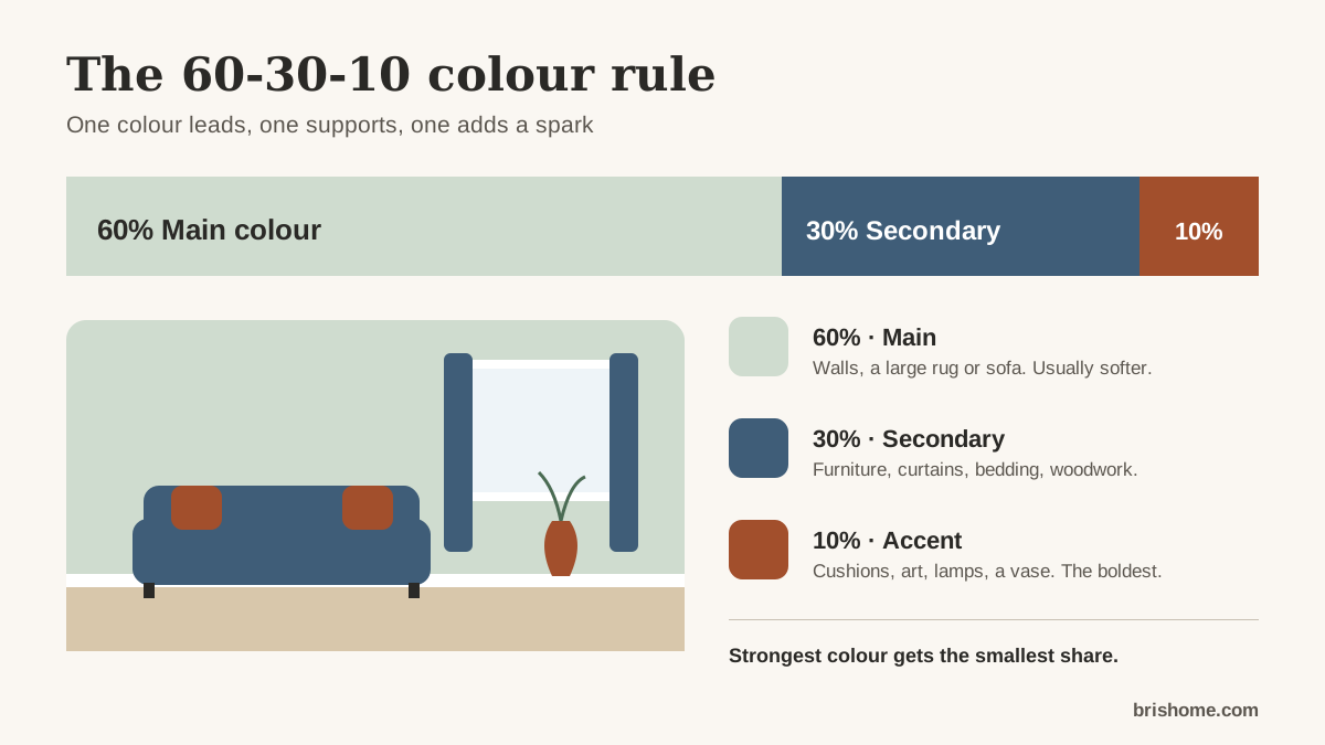
Divide the colour in a room roughly like this:
- 60% main colour. Usually the walls, and often a large rug or sofa. It sets the mood, so it is usually a softer, quieter colour.
- 30% secondary colour. Larger furniture, curtains, bedding, a feature wall or the woodwork. It adds interest and contrast.
- 10% accent colour. Cushions, a throw, artwork, lamps, a vase. This is where a bright or strong colour belongs.
The numbers are a guide, not a measurement. The point is that one colour clearly leads, one supports, and one adds a spark. Rooms that use three colours in equal amounts tend to look busy, because nothing leads.
Choosing the three colours
Start from the colour you love and decide which role it should play. A strong colour like deep teal or terracotta often works best as the accent or secondary colour. A soft colour like sage, stone or pale blue can be the main colour.
Then choose the others using one of these classic relationships between colours:
- Neutral: your colour with warm or cool neutrals. Calm and easy to live with.
- Monochrome: lighter and darker versions of the same colour. Restful and sophisticated.
- Analogous: colours next to each other on the colour wheel, such as green, teal and blue. Harmonious.
- Complementary: colours opposite each other, such as blue and orange. Lively, best with one colour toned down.
Our colour scheme planner does this for you: pick a colour and a style, and it suggests wall, main, accent and trim colours, shows them in an illustrated room, and explains why each was chosen.
Light and dark: LRV
Paint charts often list a light reflectance value (LRV) from 0 (black) to 100 (pure white). It tells you how much light a colour reflects.
- Colours with an LRV above about 60 feel light and make a room brighter.
- Colours around 30–60 are mid-tones.
- Colours below about 20 are dark and absorb a lot of light.
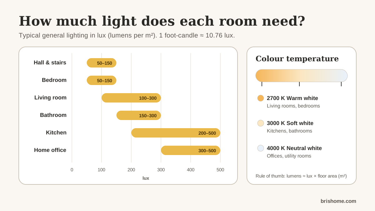
In a small or dim room, keep the main colour’s LRV fairly high and bring in darker colours through the 30% and 10%. In a large, bright room you have more freedom to go dark on the walls. If you do choose dark walls, plan for more light; our lighting calculator adds an allowance for darker rooms.
How light changes colour
The same paint looks different from room to room.
- Rooms facing away from the sun (north-facing in the northern hemisphere, south-facing in the southern) get cooler, softer light. Warmer colours can stop them feeling cold.
- Rooms facing the sun get warmer, stronger light, which can make warm colours look very warm. Cooler colours balance it.
- Bulbs matter too. Warm white bulbs make colours warmer in the evening.
Test before you commit
- Paint large samples, at least A4 size, or use sample sheets. Put them on two or three walls.
- Look at them in the morning, the afternoon and under your lights at night.
- Look at them next to your floor, woodwork and largest piece of furniture, which are part of the scheme too.
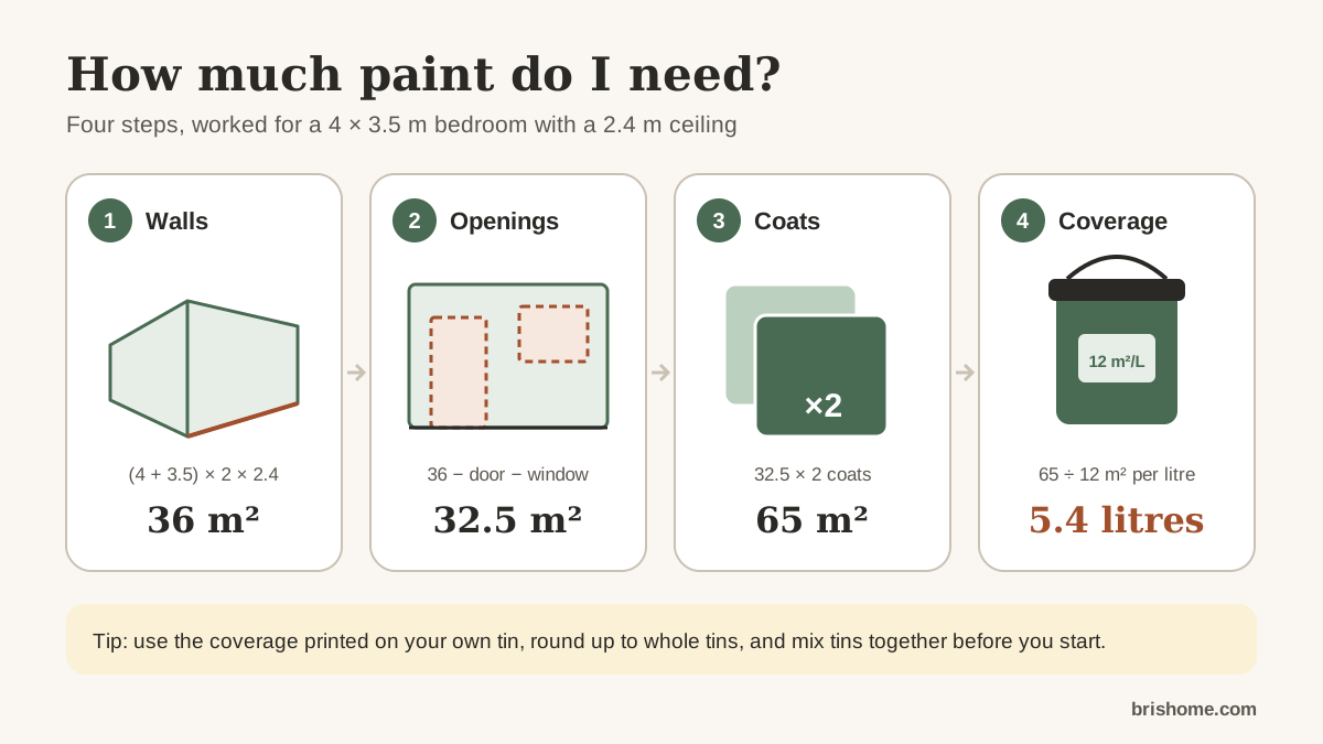
When you have chosen, the paint calculator works out how much of each colour to buy.
Quick checklist
- One colour leads (about 60%), one supports (30%), one adds a spark (10%).
- The strongest colour usually gets the smallest share.
- Check the LRV, especially in small or dark rooms.
- Test samples in the room, in different light, before you buy.
This guide is general information, not professional advice. Measurements, product instructions and local regulations come first.